Salvia-kit Dashboard v2


Salvia-kit dashboard is a professional dashboard built with Tailwind CSS. We took advantage of Tailwind's flexibility to create a fully customizable premium dashboard, with documentation designed by a developer for developers. Feel free to customize everything to suit your needs.
Features
- Support of the active route (styled by default).
- Fully customizable and without external dependencies.
- No vendor lock-in, you can export it and integrate it in your project.
- Sidebar can be aligned left or right according to your preferences (on mobile).
File Structure

File Structure explained
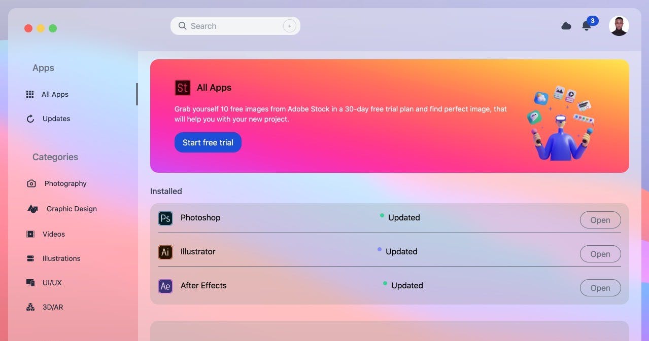
Icons used for each sidebar-item. You don't need this folder if you can provide your own icons.
It's in this file that you will add routes for each sidebar-item. it is an array of objects.
[
  {
    section : 'Apps',
    content: [
      {
        title: 'All Apps',
        icon: <AllAppsIcon />,
        link: '/admin/all-apps'
      },
      {
        title: 'Updates',
        icon: <UpdatesIcon/>,
        link: '/admin/updates'
      },
    ]
  },
]
- section : Name of the section
- title : Label for the route
- icon : icon used, imported fromicons folder or from your library
responsable of the sidebar.
compose SidebarHeader and SidebarItems components.
contains the logo displayed on top of the sidebar
automatically generates each sidebar-item according to your routes defined indata.tsx
This style sheet is used to make the scrollbar invisible for the sidebar and to apply some filters.
Export
As there is no vendor lock-in, if you already have a dashboard, you can copy thedashboardfolder into your project
- Add your routes in thedashboard/sidebar/data.tsxfile
- Replace your layout by theDashboardLayoutcomponent
Customization
You can customize everything according to your preferences if it doesn't suit you. What we have done is just provide a solid structure for better scalability and readability of the code.
The sidebar scrollbar is hidden by default but you can still scroll with the keyboards if you have several sidebar-items. You can always change its style in thestyle.module.cssfile.
In the dashboard/Layout.tsx file,Sidebar component has as propmobileOrientation, which indicates the orientation of the sidebar on small devices (viewport < 1024px).
That prop can have two possible values :
- start : sidebar will be aligned to the left
- end : sidebar will be aligned to the right